Thursday, 22 January 2009

Magazine Analysis Q and NME magazine


DPS Analysis Q Magazine


Q MAGAZINE DOUBLE PAGE SPREAD


Franz Ferdinand’s upcoming new album is featured as a double page spread in the review section of Q magazine. Through choosing to feature Franz Ferdinand it is suggested that the target audience first and foremost their loyal fans but also those who are looking to find out about new bands and albums that are released. Due to the profile of the band it is safe to assume that the target audience of the band has a very target audience from the age of 14 to mid 20s. This is because of the sound of the band which appeals to young teenagers to young adults. Franz Ferdinand are also a very mainstream band in the supposed still existing “Indie” genre. For this reason those who are interested in Indie music are likely to be persuaded into reading the article. Although they are quite a young band their songwriting likens them to older bands such as Blur, XTC and Roxy music. For this reason there target audience can expand further as they are a fresh young band in the mould of some old successful bands. For this reason middle aged people will also be interested in the band.


The article aims to inform the reader of the band and the quality of their newest album. As it is a review with only A 3 star rating it clearly sees the album as being average. For this reason they do not build it up a huge amount. The article seems quite structured and formal. It uses a more advanced level of vocabulary within the article. This is similar to the tone of the magazine which appears quite formal but also with a creative spark attached to it. The article begins with the quotation “They’ve just got it haven’t they”. This quote was taken from Morrissey the former lead singer of the notorious band The Smiths. Although previously I disagreed with the statement that Q aim to persuade the audience to buy the album, what they quite clearly do is outline the quality of the band. No doubt the quality of the first album showed Franz Ferdinand as having the potential to be a household name but after the failure of the 2nd, this opinion vanished and fast. Though the quotation, the audience is attracted to the band as it is praised by Morrissey (someone who knows a fair bit about music) and that this statement has been agreed on by Q magazine. The article also comes across as being quite opinionated as all reviews are. He says that Lucid Dreams a song released by the band in 2008 was “OK” here clearly he gives his own opinion which is in place to give the audience advice but also so that they check out the song so they can make their own judgement on it. The language used throughout the whole magazine is quite expansive


Colour is not an important factor in the review. The colour of the font is black. This is so the audience is able to read it with ease. The font of the article is times new roman which is quite a conservative font. It is used throughout the magazine. One reason for this is because the target audience is does not need crazy creative fonts in order to be attracted to the article. The context of the article is expected to be enough to pull them through. This gives off the impression that the target audience is highly educated, mature and has a large interest in the music industry.


The article addresses the audience as both an informed intelligent fan and a potential fan who is interested in the genre of music. We learn this through Q highlighting who the band sounds like and the opinions of them from fellow rock bands and musicians. The magazine sells the band through giving Morrissey’s opinion of them. He says “they’ve just got it” Through this the average rock fan who recognizes Morrissey for his work individually or with the Smiths, may be influenced by his opinion of Franz Ferdinand. This is because they trust him as he is a rock legend. The uninformed music fan will not feel Morrissey opinion is valuable because he means nothing to him. Through this we assume that the audience are people with knowledge of rock music.


The double page spread is spread out with one page filled with content while the other has an image of the band looking particularly random in a supermarket. Due to the fact that the article is a review of the album it is clear that the content informing the audience of the quality of the album is the most important thing. This is reflected through the in depth review in which background information and reviews on previous songs and albums are noted. The purpose of the image is to inform the average fan who has never heard of the band a little bit about them. Often also the appearance of the band can be enough to win over the audience and immediately make them consider listening to their music. This is the shallow reality of the world which influences the music industry. Through the image the band appears to be quite young, fresh but yet trendy. They also aim to stand out from the supermarket. They do not appear to fit in because they are all wearing dark colours. Through this the audience may believe that the band is quite fresh and different. This will attract fans as they are always looking for typically different bands.


The front cover featuring U2 is quite classy and modern. It also has quite an arty feel to it. Both the cover with the image of U2 on it and the image of Franz Ferdinand appear quite random as Bono is wearing eye liner and Franz Ferdinand is in a supermarket. This could be reemphasizing how Q is different from any other music magazine on the market.


The last point about prior knowledge is answered above through the use of Morrissey and his reputation. The aim of the review is to guide the audience whether or not the album is worth buying. Through this the need of prior knowledge is not particularly necessary although it will help determine whether buying the CD is worth it.


NME MAGAZINE DOUBLE PAGE SPREAD


The Gaslight Anthem is a punk rock band who is greatly influenced by their idol Bruce Springsteen. Due to their look and influences such as Miles Davis, a famous jazz performer, the article aims to appeal to people from a diverse group of different genres. Due to their sound and there referring to ULU in the article, it seems as though they are looking to attract an 18+ audience.


The article for the most part has a formal and a persuasive tone to it. They use big words like “epiphany” which is like a sudden realisation. This word also makes the band seem as though it is deeply influenced by Christianity. Through this the audience could be impacted once again as Christians may become interested in their music. Due to the articles formal tone this could again reinforce the audience who the article is looking to attract as it is unlikely a 15 year old teenager will want extended sentences and complicated vocabulary. It is persuasive as they describe the band as being all about the “Thrill and the thunder” of the rock industry. The audience will immediately become fixed on this as they cannot help but be excited by a band which is so wild.
The article focussed on the band seems to differ drastically to the typical language style of the magazine which can sometimes be more informal and colloquial. This may be because through covering a band like Gaslight, NME aims to broaden the audience they aim to attract.
The article heading “Born To Run” is in a bold very punk rock black colour. This links with the punk theme of the band. This links with the splats that are around the double page spread. These are platted out around the article in effect to stand out and give the article a grungy feel. There are also random parts of stars around the article which are in red and blue. This gives off the impression that the band is proud to be American but they are still a punk rock band. For the most part the colour scheme is quite basic and in its form to make it quite readable for the audience. For this reason they use times new roman font which is quite a basic text. Throughout the magazine the times new roman font is constantly used. Again to reiterate the main priority for the magazine is to make the articles clear, this is the reason for why this choice of font is used.
The use of images and text are quite evenly spread across the feature. On the right hand side of the feature there is an image of the band. The reason for this is because the audience is able to gain a greater understanding of the band. They also want us to become aware of the band because the feature in a sense is an introduction to them. It also makes it clear who the audience is. Through the bands member’s tattoos and piercings, NME makes it clear that the audience is looking to attract an alternative punk audience. The other page is almost completely text based. This shows that the audience of the magazine is unlikely to be lazy teenagers, instead NME looks to attract an older audience who are able to appreciate a biography about an up and coming music band. This means that the magazine is not attracting the typical target audience who are teenagers. The elder audience is more likely to appreciate the text because they are more intellectual. They look for good quality information and are not purely attracted by images. Through including such a vast amount of text, NME look to target their older range of their target audience.


The magazine addresses the audience as a music fan who they assume has no knowledge of The Gaslight Anthem. The reason we know this is because they give so much background information on the band. They tell the audience about the band’s sound and where they are from. It also tells us who the band is like for example “The Hold Steady”. This aims to inform the reader of the sound of the band in an attempt to make the audience interested in them. The image of the band aims to identify the target audience. The audience sees the band as having quite a street punk feel. This is further emphasized through their tattoos and piercings.
The article has quite an urban young street feel to it. This is reflected through the fonts and the images in the article. The cover also has quite a street young feel to it aswell.
The article is emplaced to inform the audience of the band. For this reason it does not demand any prior knowledge.
Friday, 16 January 2009

Evaluating Two Music Magazine Covers


Monday January 12th Evaluating Two Front Covers

Rolling stone is an established globally produced rock and pop magazine which has been running since 1967.It runs every 2 weeks and is quite a mainstream rock magazine and features most personalities or musicians that are well known to the majority of the public. It targets interesting 20- 40 year olds with an interest in music and the entertainment industry.
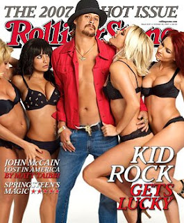
Obviously due to the fact that the magazine is music based clearly the majority of the content will be linked to music. From the image on the cover and the coverline and which says “Kid Rock Gets Lucky”. This implies that Kid Rock is having sex or is living the dream. Rolling Stone aim to use this pun to insert that double meaning. This cover line insinuates that Kid Rock is a sex symbol. This is further backed up by his clothing where to come across as more of a pimp than a musician. Kid Rock also comes across as quite a womanizer as he is seen holding many woman at the same time. The image does not give the audience the idea that he is a loyal man. Rolling Stone may be highlighting that there is not a whole lot of difference between the two. Kid Rock is notorious for sleeping with many women such as Pamela Anderson. The magazine may be aiming to explore the whole rockstar lifestyle and their experiences with exotic woman. Kid Rock is probably featured because he is living proof that this rock stars do indeed have a plenty of relationships with high profile female celebrities. The front cover image and kicker which says “Kid Rock” also insinuates that there will be some feature or interview with Kid Rock possibly to promote a new album or upcoming tour. Aside from the obvious articles about the link between supposed “groupies” obsession with rock stars, Rolling Stone does not get distracted and remembers what made it famous; music. This is shown through the kicker “Springsteen’s Magic” with the five stars alongside it. Again this could just be an article in dedication to Springsteen but it seems more likely that it links to a possible gig or album that he has just released. Although the magazine is notorious for its knowledge of music, they also have always engrossed themselves in political activity. They aim to become a rounded magazine than just a specialist music magazine. Perhaps they don’t feel that specialising in a certain area is enough to capture an immediate audience in the long term. This may be a reason why they have included a coverline titled “John McCain Lost in America”. Due to the fact that at the time of release of the article, the presidential elections was so highly coveted it only made sense on the magazines part to include a section on the election. Through the explanatory text “Lost in America”, the audience would be forgiven for believing that Rolling Stone is favours the democratic vote. Through this and the article within, Rolling Stone hopes to persuade their demographic audience to vote democratic.
The fact that the masthead “Rolling Stone” is behind the main image shows the confidence that the company has in its magazine. It also shows that the magazine is successful and well known enough that it can be placed behind the image. They expect the audience to know that their magazine is Rolling Stone. The masthead is also in a deep purple to go with the theme of the magazine of sex. It has connotations of danger, sex and love. For this particular issue the audience demographic is likely to be men for the most part, although woman to may be interested in rock stars obsession with sex. Therefore through this the image of the magazine is likely to come under scrutiny, for shedding light on this rock culture. Some woman may feel the theme is degrading and will therefore not buy the magazine any longer. Although Rolling Stone Magazine was released before the breakout of the Rolling Stones, one can not help but think of the band first. Due to this the following that the magazine is likely to get will be older. This is further proven true by the style of the font which looks like it has a very classic rock feel to it.

The colour scheme of the magazine is rather basic and reflects the following the magazine will get. The magazine is totally dependent on its history and reputation and for that reason it continues to attract reader’s world wide of all audiences.
There is not a huge amount of strategy to attract the audience. Again their reputation speaks for itself. What is evident however is that the pull of half naked woman can often be too much for men to turn down. They are also attracted by the content inside the magazine for example interviews and articles.


NME
NME is a popular music magazine which runs weekly and has been since 1950. Unlike Rolling Stone, it is purely a British based magazine. Unlike Rolling Stone which covers a wide range of rock and pop, NME is more specific and celebrates young “Indie and Alternative” music. Its target audience is young adults ranging from 15- 21 years old. NME is dissimilar to Rolling Stone in that it is far more focussed on Indie and Alternative music and the culture which surrounds it.
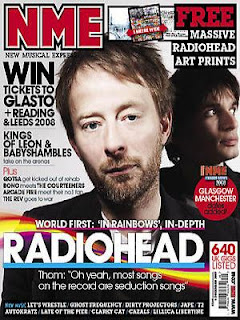
The strap lines and kickers reveal what the content of the magazine will be like. The image of Radiohead implies that the headline part of the magazine will indeed revolve around them. The image of the lead singer looking directly at the reader is also very personal and insinuates that singer is prepared to give out some information about him and the band. The kicker “Win Tickets to Glasto+ Reading, Leeds” also informs the reader that there is a competition available within the magazine.
The competition also acts as a persuader for the audience to buy the magazine. They know that the audience will be interested in the competition based on the fact that they appear keen on music and are therefore likely to attract a host of gig goers. On the cover there are many “freebie” for example many fans will want Radiohead art prints and because of solely this they will go ahead and buy the magazine.


It appears strange that Radiohead are on the cover of a teen music magazine. Radiohead’s success came in the 80s as they appeared as a strange misunderstood grunge band. Since then the music industry has moved on to bands such as the Kooks and Bloc Party. Only recently have the influx of old bands return and restored their supremacy on the music scene. It is unexpected that NME (New Musical Experiment) would feature such an old band because it stands against what they usually do. They generally feature upcoming new artists but due to the ever growing demand of old bands returning, NME has manipulated its general features in order to satisfy its audience.
The main cover line suggests that Radiohead have returned in a different form. “Most songs on the record are seduction songs.” Does this mean that the reason Radiohead have been featured is because their new album varies dramatically to those of its predecessors which were mainly quite slow and depressing? Through featuring Radiohead, NME could also be attracting an older audience because Radiohead has quite a mature middle aged following.
The cover also appears to use a bigger colour scheme. They use bright colours such as yellow, blue, pink and red. This keeps the cover looking young and therefore similar to its main target audience. All the fonts used are quite tall, big and bold. This is so that the teenage audience will notice the topics of the magazine. They are unlikely to pay attention to long sentences in small font, due to their lazy teenage ways.
The masthead NME’s font is quite block looking and again is bold in order for the audience to see it and pay attention to it. The colour red is also quite bright and can’t help but catch attention. The font is also quite futuristic and young so that it represents the demographic target audience. The masthead is also quite grunge looking as it looks as though it could be done by graphite. This again enhances the young feel of the magazine.

Monday, 12 January 2009

Contents Page Mock Up

The contents page heading is in green which is the same colour as the font used on SME’s masthead. This means that my magazine will stay consistent with its fame and it also reiterates the link to St Marylebone.

Text- The text in the contents page informs the reader of where the article can be found in the magazine and also what it is about. The text on the contents page will generally fall under certain categories for example editorial pillars which outline what the article is about. In other cases it may cover sports, events etc. The font is times new roman. This is because it’s very simple and easy to read. The colour will be green to link with St Marylebone again.

Image: Again to link to St Marylebone school.
Background: White so the colours blend in and the contents page is easy to read after all it is vital that the audience knows where to find the features of the magazine.

Sunday, 11 January 2009

Evaluation Of Magazine Cover/Content Page Preliminary Task

Evaluation of Cover

The cover of my magazine SME challenges develops and uses classic media conventions. SME uses classic media conventions because it has many things included on most magazine covers. This includes a masthead. SME is abbreviated from St Marylebone Education. The reason for this is because it makes the masthead bolder, short and eye catching. For the teenage target audience, their general preference is things which are short and don’t take along time to read. Therefore the masthead is more likely to be successful in attracting its target audience. The strap line is another classic media convention. It is emplaced above the masthead and is in a smaller font. This is purely so it doesn’t take priority over the masthead but is still in a position to be seen. The strap line reads “First for school news”. This is effective and attracts the audience because it shows that they are the most effective and quite simply get the information before anyone else, or before any other format. It shows that the magazine is up to speed and means that the students can keep up with facts they need to know on time. This links to the actual goal of the strap line which is to persuade the audience to pick up the magazine. The magazine also uses kickers and explanatory texts which highlight the features which are discussed within the magazine. Due to the strict time scale and lack of creativity on my part I only included three of each. Most magazines have roughly five to six. The advantage of this is that the audience can be persuaded further through the finding out more of the features in the actual magazine. The advantage of having so few kickers and explanatory texts is that it kept my cover very clean and concise and away from a huge problem which many magazines have, overcrowding. It makes the cover look more attractive and less forced. This is a fresh magazine idea as they feel the clean free feel of the magazine will get them more buyers. This develops media conventions further. Another quite conventional media convention that is on SME’s cover is the button. Generally in magazines the button is used to advertise magazine prizes where the audience can win something. This attracts an audience because people are attracted by getting things through using little time and effort. This is the reason I used it on my magazine cover. It is placed in the right hand size of the image in a small bubble because it isn’t the main feature of the magazine but in its position can still attract a certain amount of attention.

In a sense the media conventions are challenged as every detail of the magazine is replicated on that of the music magazine “NME”. SME hopes that the audience recognizes that they are replicating NME because it is a successful popular magazine. They are also aware that many young people read NME so they hope through moulding their cover on NME’s the students at school will be attracted. The camera angle of the image is one widely used for magazine front covers- the medium shot. This specific shot was employed so that the image of the models whole body is revealed and also so that the audience can gain an understanding of the school environment and what it looks like. In a sense, the magazine cover challenges typical media conventions in that; it is ridden of any form of “fixing” of the surroundings or the model. This shows how the school is proud of the school and the individuals of the school because they show them in a way that is real. The cover also features a normal student from St Marylebone’s sixth form Danielle Emina. She is 17 years old and is emplaced to represent the values of the school. These are expressed through the motion on her face. Danielle’s smile has connotations of happiness and that she enjoys studying at St Marylebone. Again through featuring Danielle, it shows how the school gets the students involved and also to reflect them. It also shows that they are proud of the students. Due to the fact that it features the students, naturally they want to buy something which they are proud of. This challenges media conventions as most magazines would rarely have people inside their company on the cover occur as the model is often the selling point of a magazine. Danielle is also holding a file to show her connection to working at school. The smile on her face shows her enjoyment of learning aswell. The fact that she appears so fashionable is so it links to the cover and makes everything on it link. Most magazines use this technique so it keeps to media conventions.

The language was determined by the target audience that SME looks to attract. In this case the target audience is the students who study at St Marylebone sixth form. For this reason, the style of writing on the cover is informal, fun and involves a great deal of puns. This is because that is what that target audience is generally attracted to. This is a technique used by many magazines that target a young audience. This is one of the selling points of the magazine. Generally students would be forgiven for believing that the typical school magazine would be dull and very formal. SME attempts to go against that stereotype by making the language entertaining and as though it has been written by a student at the school, someone who the audience can relate to. Not many magazines employ this technique, so it does challenge typical media conventions. Most magazines feel their magazine will be more successful if they employ qualified experienced journalists because the level of their work would be expected to be greater. SME is aware that their students don’t just want to read another textbook and would prefer something that reflected their student’s voices. Giving power to the students through SME does just that.

The language on the cover of the magazine is also very motivational as it is based purely on to help the students with many aspects of school life. For example the kicker, “Unifying You” will attract a wide selection of the audience because many teenagers are keen on presenting themselves well and saving money! Any guide to help them do this successfully will persuade the audience to buy a copy of the magazine. Many magazines focus on their audience in order to successfully sell their magazine. Generally woman’s magazines are well known to use this technique because they woman are said to be particularly interested in being their best possible self. SME also wants their audience to feel this way but more in an educational sense. This technique is also founded in teenage magazines because teenagers like advice on how to be better. This is a common media convention which would probably also be founded in educational magazines but would probably be more based strictly on academic work rather than student lift. On the cover of SME, there are only four fonts used. The advantage of this is that it keeps the cover clear and concise, however what can occur is that the cover lacks creativity and can be boring. This means that it doesn’t connect with the fun feel that the magazine is meant to have. This is also like the sizes of the fonts. The kickers are generally the same size as so are the explanatory texts. This keeps the layout consistent and clear. This is a media convention which most magazines use as they do not want to overcomplicate the cover and therefore turn away the audience.

The colour scheme of the magazine is representative of the school and the students at the school. When one thinks of Marylebone’s denotations they cannot help but see the green uniform. Although at 6th form uniform no longer applies, the school wants to show there history and not let it be forgotten. This is the reason the masthead and button are green. I also used purple because it’s the colour which Danielle is whering so the cover tends to blend it more and not look overdone. It also represents the freedom that the students are allowed and highlights the fact that 6th has no school uniform.

As the magazine is run by the school it would have no distributor. This means that the goal of the magazine would not be to sell copies but would instead be for them to pick them up and take into account what the magazine says to help them with their schooling at St Marylebone. SME has no barcode. This shows that it does not aim to sell. All magazines which are for sale include the price of the magazine and a barcode.

The magazine aims to attract a unisex 6th form audience between the ages of 16-18. Through including a teenager on the cover this becomes clear and the fact that she is whering her own clothes show how the magazine is only appropriate for 6th formers. The reasons they are attracted are listed above.

The contents page holds absolutely no techniques which pull in the reader. All they do is set out where the audience can find the articles they are looking for within the magazine. What the contents page does do is reemphasize that the magazine is related to the St Marylebone School through their logo. What would have made the contents page better was if it included activities which were taking place at school just to keep the students up to data with the current topics at St Marylebone. NME for example will have a picture of someone they are interviewing to relate the article to the contents page. Through this the audience may become interested in the person based on how they look and therefore will be interested in reading the interview

Technologies

Overall I believe my understanding of skills on Adobe Photoshop improved greatly during this task. The tool which I particularly enjoyed and valued was cropping because it helped me remove irrelevant parts of images and to keep the important part of it. This was handy when deleting irrelevant parts of my cover. I hope to take on more skills in the actual task to improve my work.