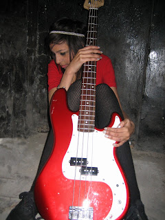
As there is no masthead, kicker or explanatory lines, these all must be added to the front cover of the magazine in order for it to appeal to its target audience. It will look to do this through:
- large bold fonts that will stand out so that the audience takes notice of them.
- the use of colors so that the cover will be clear and easy to read whilst also being effective in terms of attracting its target market. Based on the image alone, Upcoming no that it will be wise to use red fonts on the cover as they will stand out from the black background. The red also has connotations of excitement and danger. This will appeal to the the audience of "Upcoming" as the magazine is focused on the genre of indie which is quite an exciting fast genre itself.
- Upcoming will also take into account typical media conventions such as a barcode and the date of the issue release (eg by month by week)in order to make their magazine appear more professional and efficient.
 As there is no masthead, kicker or explanatory lines, these all must be added to the front cover of the magazine in order for it to appeal to its target audience. It will look to do this through: